


Many photographers choose sRGB or Adobe RGB in their camera without really knowing why.
Here’s the simple truth:
- If you share photos online → use sRGB
- If you print professionally and know colour management → consider Adobe RGB
- If you shoot RAW → your in-camera colour space matters less than you think
Let’s break it down properly.

Why So Many Photographers Get This Wrong
I often see photographers set their camera to Adobe RGB because they think:
“Adobe RGB sounds more professional.”
Or:
“It must give better colour.”
But that’s not how it works.
Colour space does not magically improve your image. It simply defines how many colours can be represented and how they are handled.
And if you choose the wrong one for your workflow, your photos might look flat, dull or oversaturated — especially online.
What Is sRGB?
Think of sRGB as the universal language of colour.
It is:
- The standard for the internet
- Used by social media platforms
- Supported by almost all devices and screens
- The safest option for sharing
If you upload Adobe RGB images to platforms that expect sRGB, the colours may shift and look washed out.
That’s why most photographers should simply use sRGB.
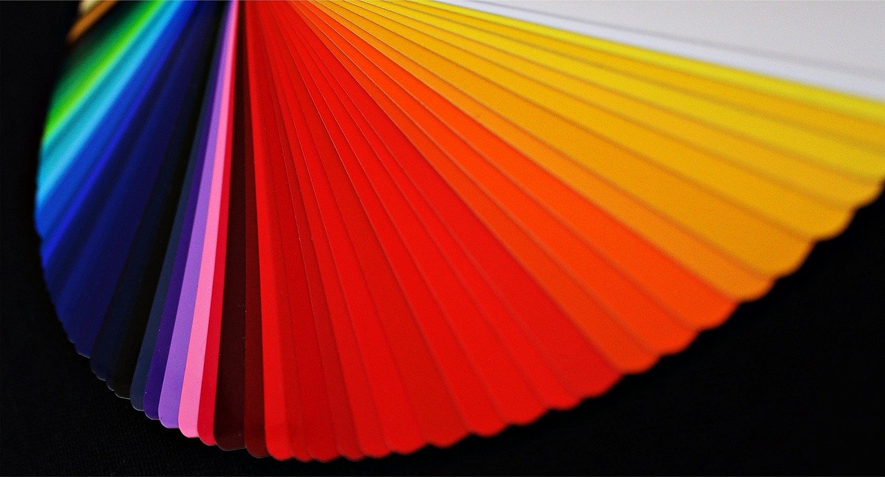
What Is Adobe RGB?
Adobe RGB includes a wider range of colours, especially in greens and cyans.
It can be useful if:
- You print large fine-art prints
- You work with professional labs
- You understand colour-managed workflows
- Your monitor is calibrated and supports wide gamut
But here’s the key point:
If your monitor cannot display Adobe RGB fully, you won’t even see the difference properly.
And many screens simply can’t.
Important: What If You Shoot RAW?
This is where many people get confused.
When you shoot RAW:
- The camera colour space setting does NOT limit your RAW file.
- It only affects the preview and JPEG files.
- You choose the final colour space when exporting from Lightroom or Photoshop.
So if you shoot RAW (which most of us do), the in-camera setting is less critical than you think.
Personally, I still leave mine on sRGB to keep things simple.
Common Mistakes Photographers Make
1. Choosing Adobe RGB “because it’s better”
It’s not better. It’s just wider. And wider is only useful if your whole workflow supports it.
2. Uploading Adobe RGB images to social media
This causes colour shifts.
3. Ignoring export settings in Lightroom
Even if you shoot RAW, exporting incorrectly can ruin your colour.
Always check:
Export → File Settings → Colour Space → sRGB (for web)

So Which One Should You Use?
Here’s my honest advice:
If you:
- Share on Instagram, Facebook or your website
- Send images to clients digitally
- Are unsure about colour management
→ Use sRGB
If you:
- Print professionally
- Work in a colour-managed environment
- Have a calibrated wide-gamut monitor
→ You may use Adobe RGB
But only if you truly need it.
Final Thoughts
Photography is about feeling and communication.
Colour is part of that feeling.
But don’t let technical settings distract you from what really matters — light, composition and storytelling.
Keep your workflow simple.
Get the fundamentals right.
And only complicate things when your work truly demands it.
If you’re unsure about your camera settings or export workflow, please join our Thursday Zoom editing session. We’ll go through it together.
And if you’re still figuring out your learning path, join us on our Wednesday evening outing. Sometimes clarity comes from doing, not just reading.
You can find all workshops and photo tours at:
https://comfortcapture.com/photo-workshops-and-photo-tours/