
Have you ever looked at a photo and instantly felt something… even before you understood what you were seeing?
That’s the power of colour.
Colour isn’t just something nice to have in your photo — it shapes mood, guides attention, and tells a story. Once you start using it intentionally, your photos will immediately feel stronger and more memorable.
Let’s keep things simple this week.
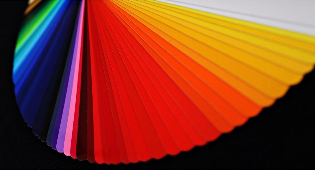
Quick Summary
Red = attention, energy, drama
Blue = calm, mood, sometimes sadness
Green = freshness, nature, balance
Yellow = warmth, happiness, light
Black & White = emotion, simplicity, timeless feel
🔴 Red – The Attention Grabber
Red is loud. It demands attention.
Even a small red object in your frame will instantly pull your viewer’s eye.
When to use it:
-
To create a clear focal point
-
To add energy or tension
-
To make your subject stand out
Simple tip:
If your photo feels a bit boring, try adding a touch of red — it works almost instantly.
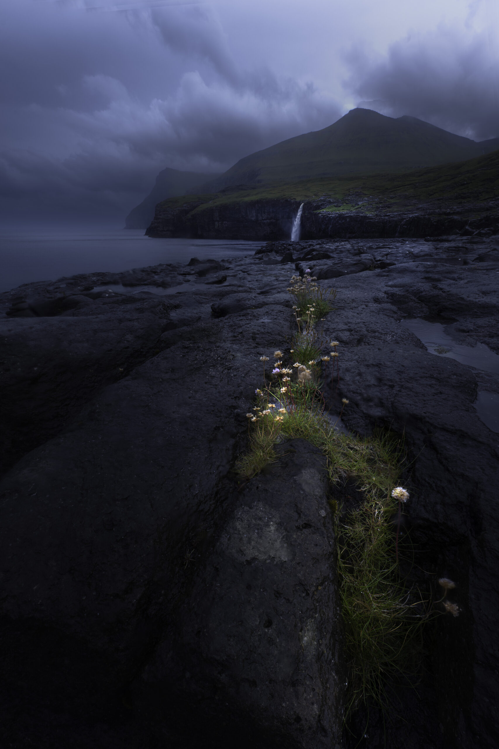
🔵 Blue – Calm… or a Bit Lonely
Blue can feel peaceful, but it can also feel cold or distant depending on how you use it.
What it communicates:
-
Calm and serenity
-
Cool, quiet moods
-
Sometimes loneliness or isolation
When to use it:
-
Seascapes and sky shots
-
Blue hour photography
-
Minimalist scenes
Pro tip:
If your photo feels too cold, warm it slightly in your white balance. Small adjustments make a big difference.
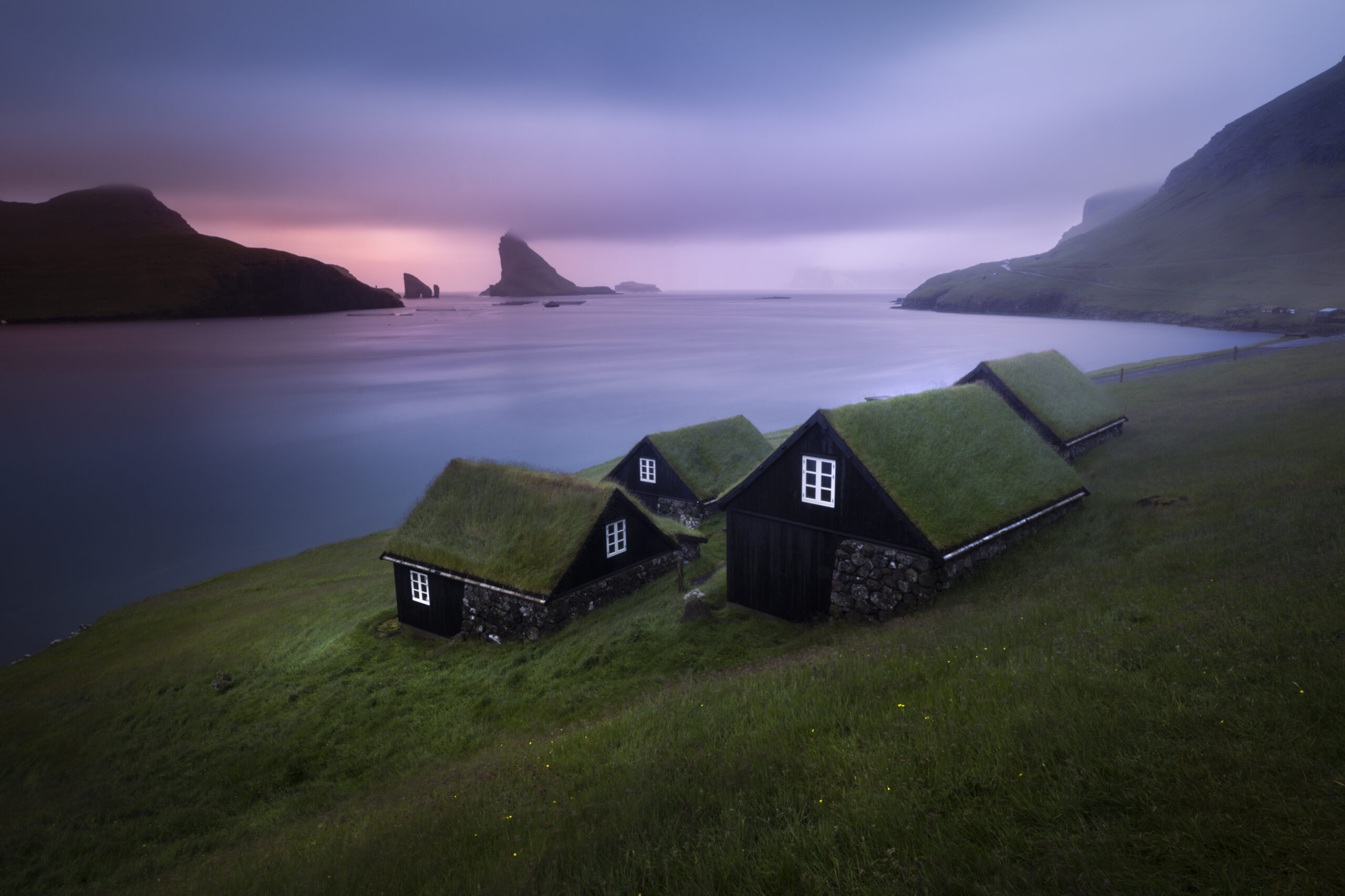
🟢 Green – Natural and Easy on the Eyes
Green is relaxing and very easy to work with.
It naturally suggests:
-
Freshness
-
Nature
-
Balance
Best for:
-
Landscape photography
-
Forest and nature scenes
Simple tip:
Use a polariser filter if you can — it deepens greens and removes reflections.
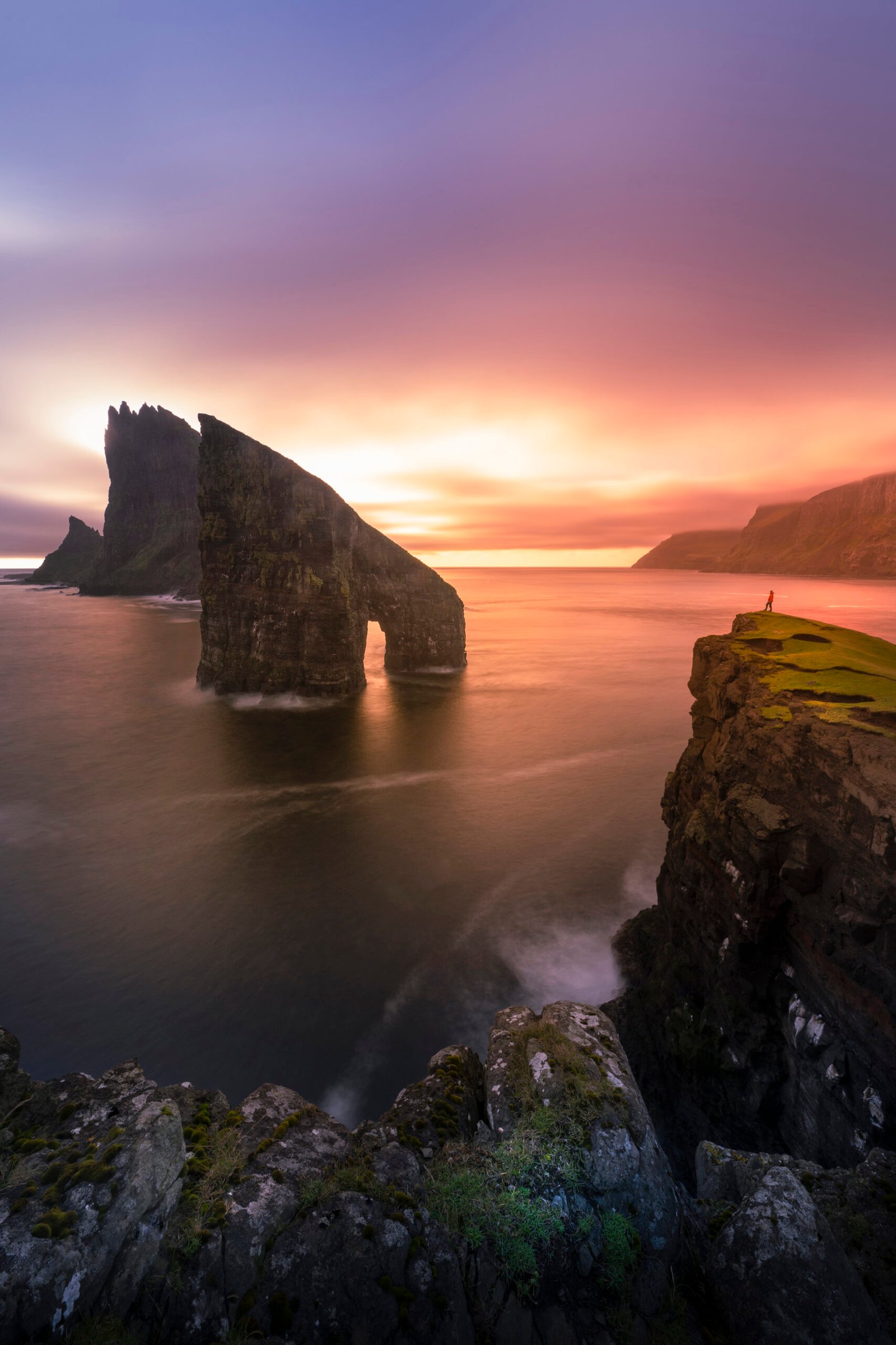
🟡 Yellow – Warm and Cheerful
Yellow is the colour of sunlight.
It feels:
-
Bright
-
Positive
-
Welcoming
When to use it:
-
Golden hour photography
-
Sunlit landscapes
-
Warm city scenes
Watch out:
Too much yellow can feel overwhelming — use it to highlight, not dominate.

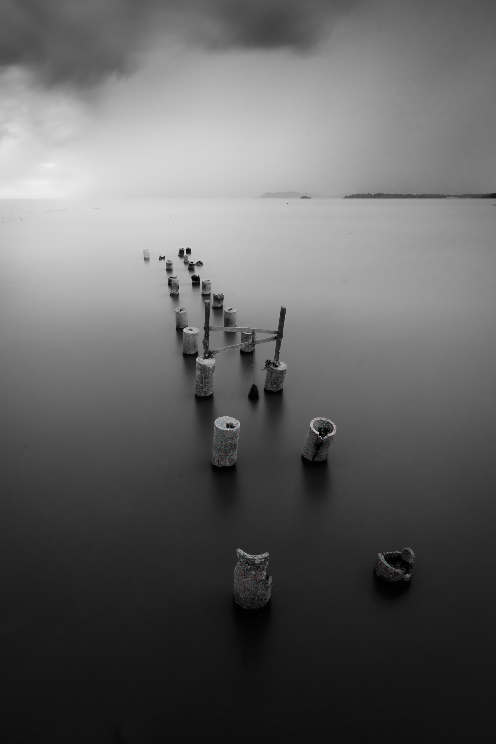
⚫⚪ Black & White – Focus on Emotion
Sometimes colour is distracting.
Removing it helps you focus on:
-
Light and shadow
-
Shapes and contrast
-
Emotion
When to use it:
-
High contrast scenes
-
Portraits
-
Minimal compositions
Simple test:
If your photo still works in black and white, it’s a strong image.
How to Start Using Colour Better?
You don’t need to overthink it.
Try this:
👉 Pick one main colour
👉 Build your composition around it
👉 Keep everything else simple
That alone will improve your photos.
Common Mistakes to Avoid
-
Too many colours competing for attention
-
Over-editing colours until they look unnatural
-
Ignoring distracting colours in the background
-
Relying on colour instead of good composition
Final Thoughts
Colour is one of the simplest ways to improve your photography — but many people overlook it.
Start noticing colours more.
Start using them with intention.
And your photos will feel more powerful and memorable straight away.
Want to Learn How to Edit Photos Like This?
If you’d like to go further and learn how to edit your photos so they look clean, natural, and memorable…
I run a live Zoom editing session every Thursday at 9pm, where I walk through real photos step by step and explain my thought process.
It’s simple, practical, and perfect if you want to improve your editing without feeling overwhelmed.