
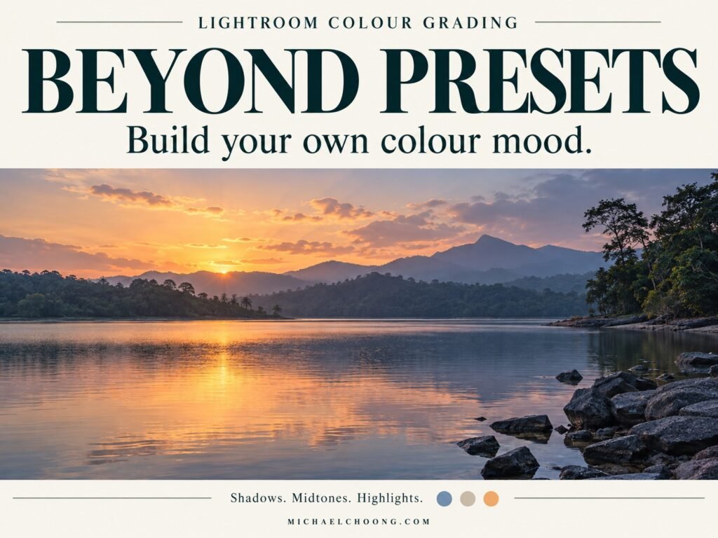
A sunset can lose its evening feel when we make everything warm.
The sky becomes golden, but so does the water. The shaded grass turns yellow. The small differences that made the light interesting begin to disappear.
Sometimes, leaving a little coolness in the photograph makes the warmth more noticeable.
Last week, we explored one photograph with three different moods. We tried warm, cool and muted treatments, with three presets to help you experiment.
This week, let’s open the controls behind the look.
We’ll build a gentle evening colour treatment in Lightroom, one step at a time. Along the way, I’ll explain what each adjustment is meant to contribute and how to decide whether your photograph needs it.
Start with a reason for the colour
Imagine a reservoir after sunset. There’s still a pale glow near the horizon, while the trees and foreground have slipped into shade.
For this exercise, our intention is simple. Keep the last warmth of the evening while preserving the quiet feeling around it.
That gives our colours a job. A warm tint can support the glow. A restrained cool tint can suggest the shaded surroundings.
This relationship can help separate parts of the scene, but it won’t create depth on its own. Light, brightness and composition still matter. Warm and cool colours also carry different associations for different viewers.
Think of the treatment as a possibility to test. A misty morning or a forest under soft light may need a completely different approach.
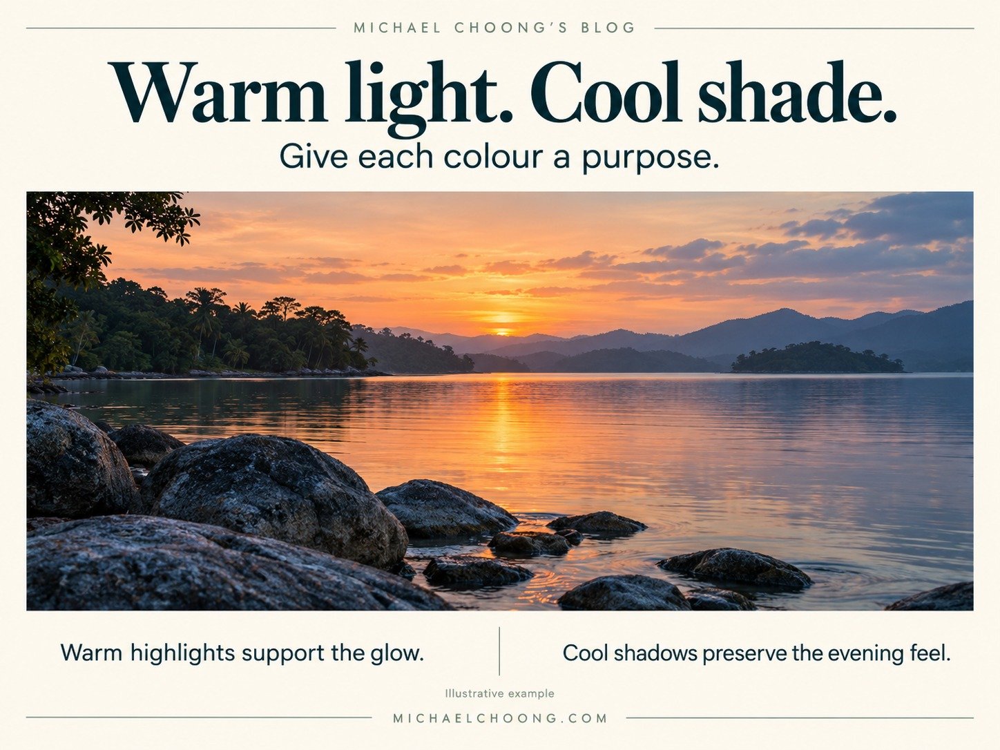
Shadows, midtones and highlights describe brightness
Lightroom’s Colour Grading panel works with tonal ranges. It doesn’t recognise the sky as the sky or the water as the water.
The darker areas receive the shadow treatment, the lighter areas receive the highlight treatment, and the tones between them receive the midtone treatment. These ranges overlap.
In a reservoir photograph, they might appear like this.
| Tonal range | Possible areas in the photograph |
|---|---|
| Shadows | Dark trees, the underside of a bench, shaded grass |
| Midtones | Much of the water, cloud detail, softly lit ground |
| Highlights | The brighter horizon, luminous cloud edges, bright reflections |
A single cloud can contain all three. A highlight adjustment may affect both the sky and its reflection.
That’s why you need to watch the whole photograph. If you want to change only one particular area, a local mask may be more appropriate than a broad colour grade.
Prepare your photograph first
Choose one image with a useful spread of dark, middle and light tones. A quiet evening landscape is a good match for this exercise.
In Lightroom Classic, open it in Develop. Set your preferred profile, exposure and white balance, and make your basic tonal adjustments before grading. Keep the original atmosphere of the light.
Avoid trying to correct an unwanted green cast by adding a strong pink grade. Deal with the cast first, then make your creative choices.
Create a virtual copy for practice and keep your balanced starting edit beside it. Begin with the Colour Grading controls reset, rather than layering this lesson over an existing grade.
The settings below are proposed learning values. They aren’t measurements taken from an edited RAW file, and they won’t produce an identical result on every photograph.
Find the controls in Lightroom
Open the panel labelled Color Grading in Lightroom Classic. Select an individual tonal wheel for a larger view. If the numeric Hue and Saturation controls are hidden, expand the small disclosure arrow beneath the wheel.
Hue chooses the tint. Saturation sets its strength. Luminance changes brightness within the grading treatment. Moving the point away from the wheel’s centre increases saturation.
For now, leave all grading Luminance values at 0 and leave Global saturation at 0. This keeps our exercise focused on colour.
Adobe’s Colour Grading tutorial provides an additional demonstration of the controls.
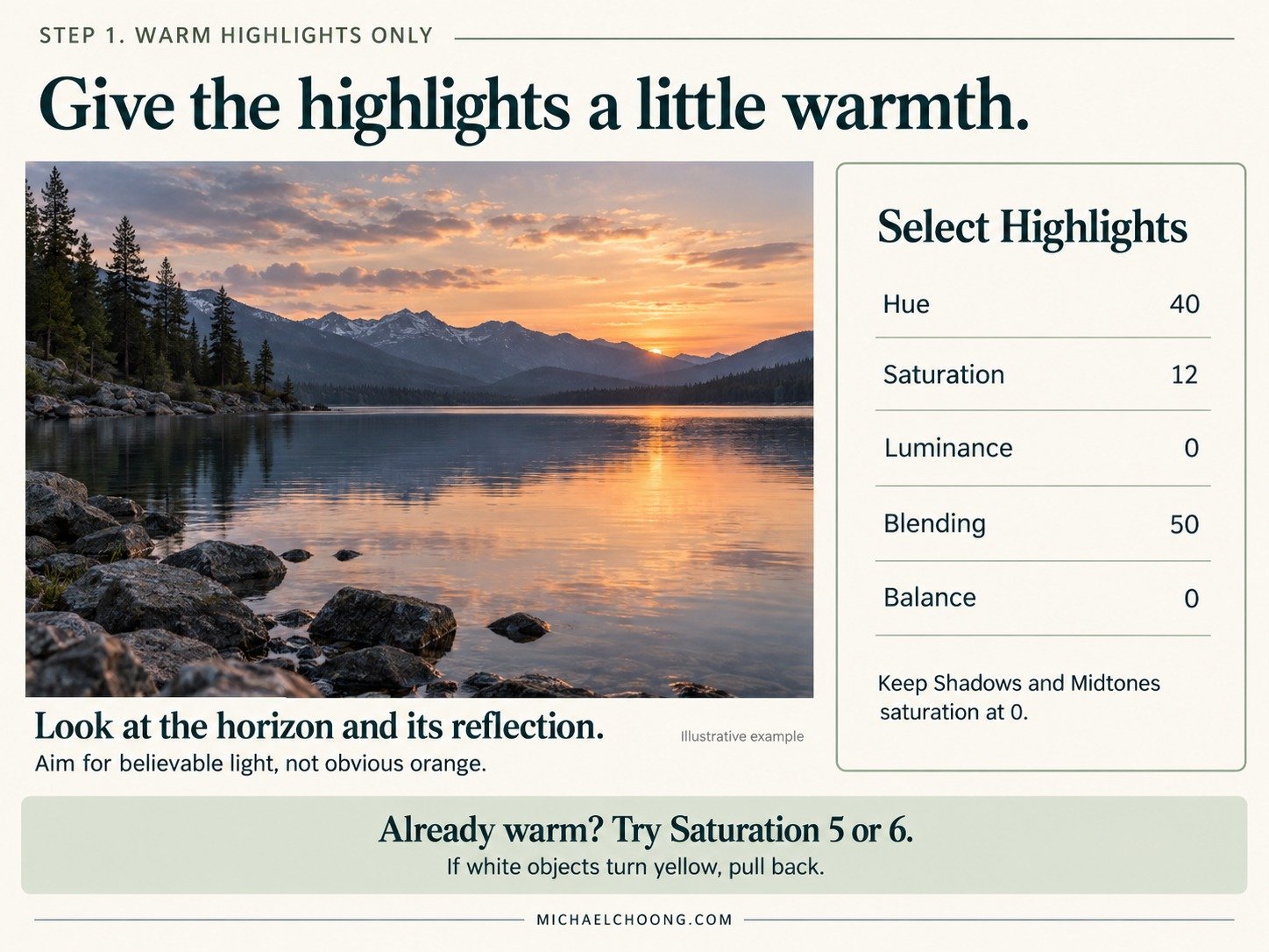
Step 1. Give the highlights a little warmth
Select Highlights and enter these starting values.
| Control | Value |
|---|---|
| Hue | 40 |
| Saturation | 12 |
| Luminance | 0 |
| Blending | 50 |
| Balance | 0 |
Keep Shadows and Midtones saturation at 0.
Hue 40 gives us an orange towards yellow tint. At low saturation, the intention is a gentle warmth in the lighter tones.
Look at the horizon and its reflection. Then check the rest of the picture. The useful question is whether the light feels more convincing, not whether the orange is obvious.
If the scene already contains strong warmth, reduce Saturation to 5 or 6. If a white object begins looking noticeably yellow, that’s another reason to pull back.
This is the first learning preset, Warm Highlights Only. It may already be enough for your photograph.
Step 2. Explore cooler shadows
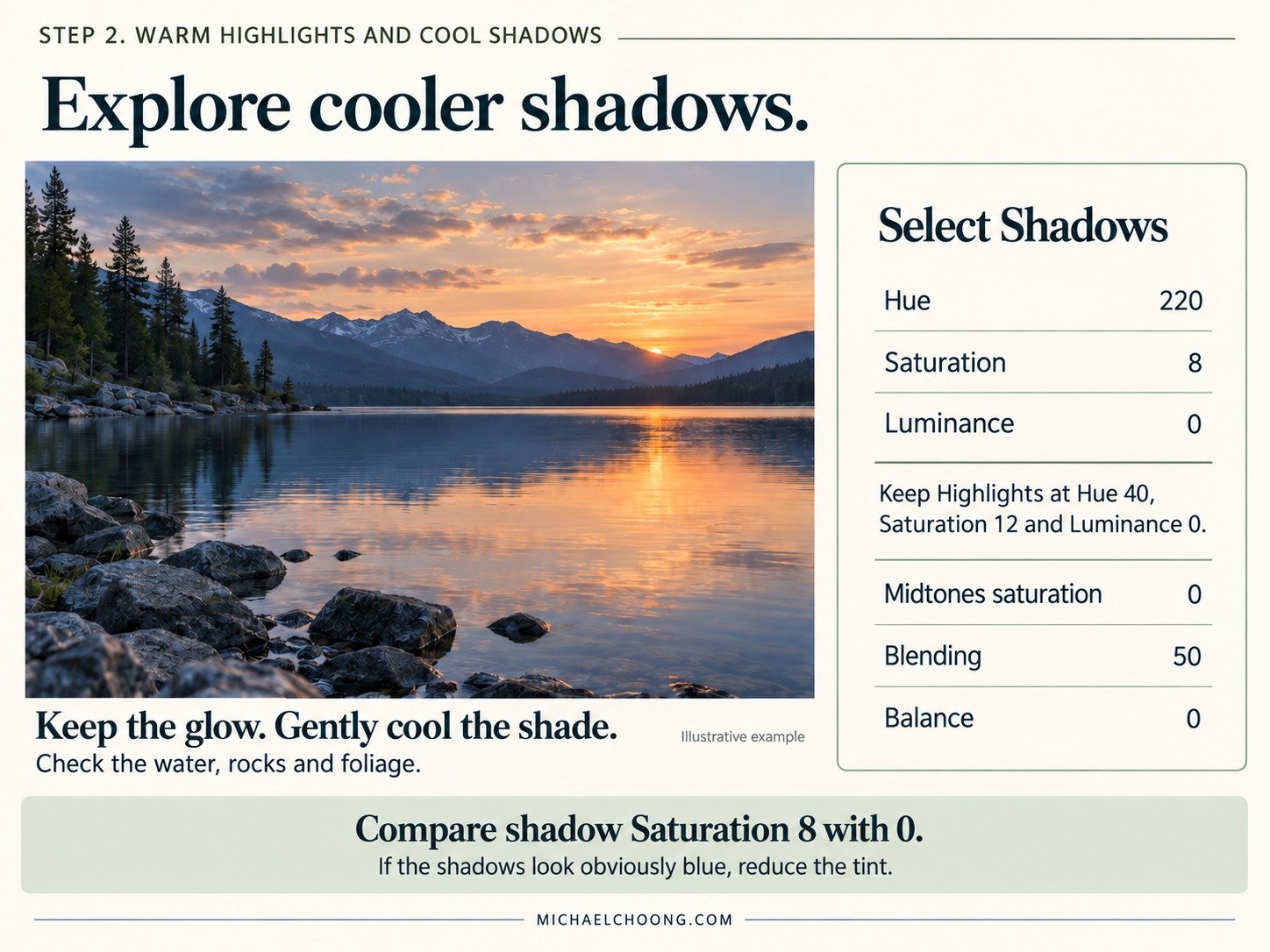
Keep the highlight settings and select Shadows.
| Control | Value |
|---|---|
| Hue | 220 |
| Saturation | 8 |
| Luminance | 0 |
Leave Midtones saturation at 0, Blending at 50 and Balance at 0.
The blue tint introduces a small colour difference between the darker surroundings and the warm light. It can help the evening glow feel distinct without warming everything around it.
Compare the image with shadow Saturation at 8, then at 0. Look especially at water, rocks and foliage.
If those areas become obviously blue, or the picture feels less believable, reduce the tint. Your original shadows may already be cool enough.
This is the second learning preset, Warm Highlights and Cool Shadows. The only change from the first stage is the shadow tint, making its contribution easier to judge.
Step 3. Understand Blending and Balance
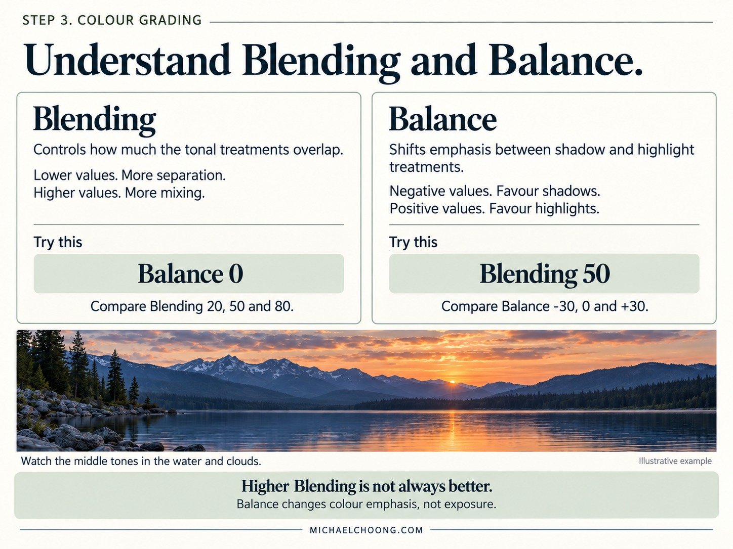
These controls are easy to overlook because the colour wheels are more immediately appealing. Yet they can make the difference between a comfortable treatment and a tint that seems to spread everywhere.
Blending controls how much the tonal treatments overlap. Lower values separate them more, though transitions remain gradual. Higher values let them mix across more of the photograph.
Balance shifts which tones receive more of the shadow or highlight treatment. Negative values favour the shadow treatment. Positive values favour the highlight treatment. It also changes the midtone range.
Try this short comparison without changing your chosen hues or saturation.
- Leave Balance at 0. Compare Blending at 20, 50 and 80.
- Return Blending to 50. Compare Balance at minus 30, 0 and plus 30.
- Watch the middle tones in the water and clouds as you move each control.
Higher Blending isn’t automatically better. It may soften the separation you liked. Balance also isn’t an exposure adjustment, even if the colour change alters your impression of brightness.
For a fuller technical explanation, see Adobe’s introduction to Colour Grading.
Step 4. Decide whether the midtones need anything
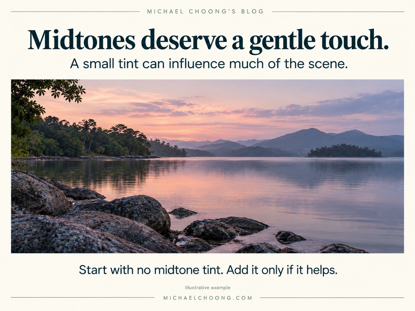
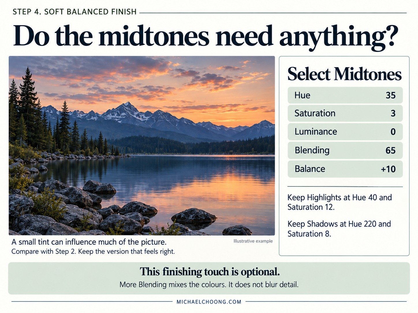
Many photographs contain a large amount of middle tone. A small tint here can therefore influence much of the picture.
For the third version, try a very gentle warm midtone and a little more overlap.
| Control | Value |
|---|---|
| Midtones Hue | 35 |
| Midtones Saturation | 3 |
| Midtones Luminance | 0 |
| Blending | 65 |
| Balance | +10 |
Keep Highlights at Hue 40 and Saturation 12, and Shadows at Hue 220 and Saturation 8.
The intention is a slight warmth through the middle tones, with more mixing between the treatments and a modest bias towards the highlights.
Compare it with stage two. Does it bring the colours together, or does the image now feel too warm across the whole frame.
If you prefer the earlier version, keep it. The third preset, Soft Balanced Finish, is an optional interpretation. Its name doesn’t make it the best choice for every scene.
The higher Blending value softens the separation between colour treatments. It does not blur the image or reduce texture.
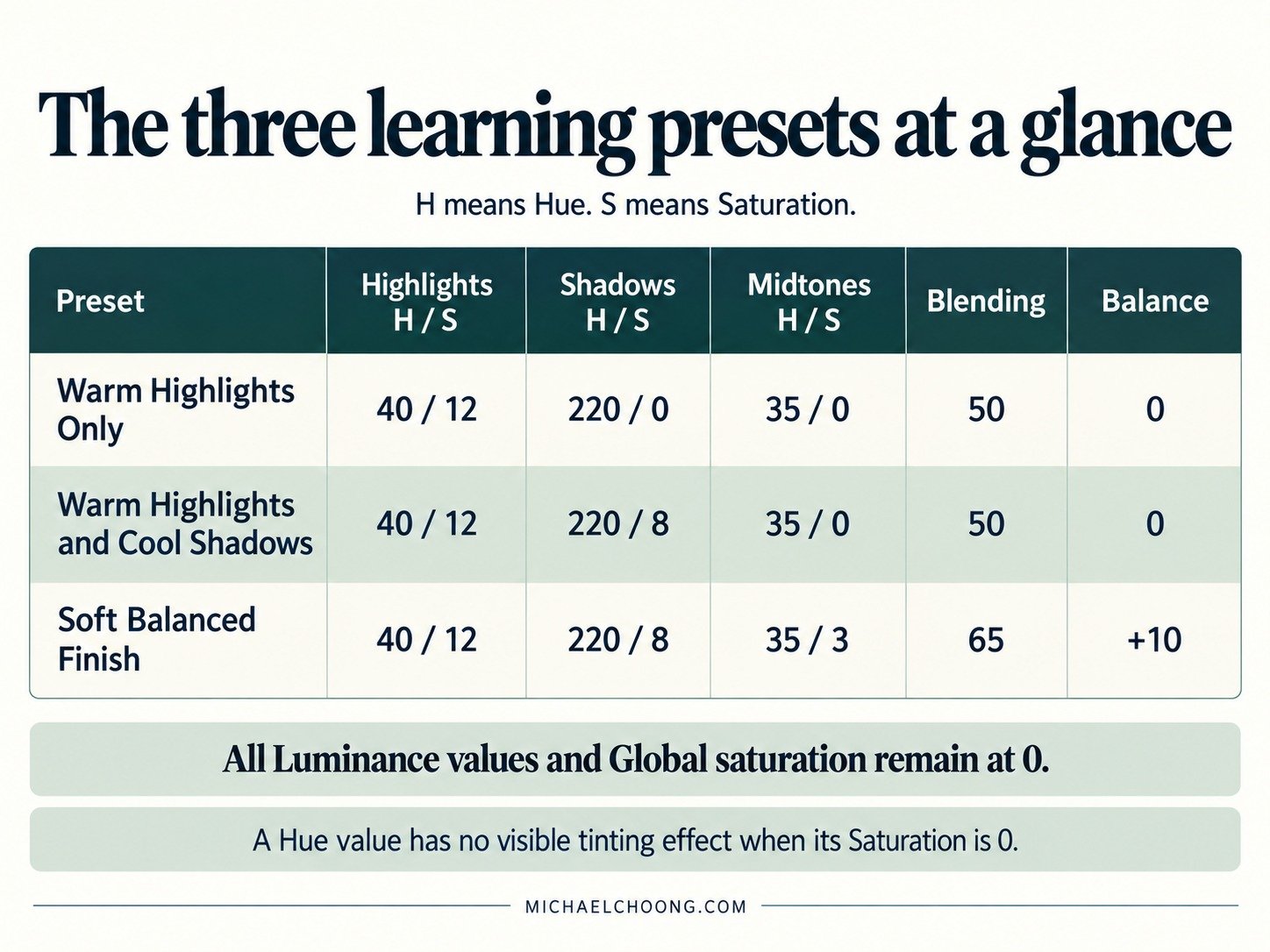
The three learning presets at a glance
All Luminance values and Global saturation remain at 0. In this table, H means Hue and S means Saturation.
| Preset | Highlights H / S | Shadows H / S | Midtones H / S | Blending | Balance |
|---|---|---|---|---|---|
| Warm Highlights Only | 40 / 12 | 220 / 0 | 35 / 0 | 50 | 0 |
| Warm Highlights and Cool Shadows | 40 / 12 | 220 / 8 | 35 / 0 | 50 | 0 |
| Soft Balanced Finish | 40 / 12 | 220 / 8 | 35 / 3 | 65 | +10 |
A Hue value has no visible tinting effect when its Saturation is 0.
Apply each preset to a separate copy of the same balanced edit, at Amount 100 if that control is available. Open the Colour Grading panel and compare the settings with the table.
These presets change only Colour Grading. They replace the existing grade, while leaving your exposure, white balance, profile, crop and other editing controls alone. Results still depend on those underlying choices.
Download and try the learning presets
I’ve prepared three learning presets to accompany these steps. They give you a way to compare each stage without rebuilding the settings every time.
[Download] Get the 3 Beyond Presets learning presets.
You can follow the preset installation guide for the import process. This new set appears under Michael Choong – Beyond Presets, rather than last week’s Colour Moods group.
If you missed the earlier collection, you can also download last week’s three mood presets.
When the colours don’t look right
The whole picture feels orange
Return the midtone Saturation to 0. Reduce highlight Saturation, then check whether Balance is spreading that treatment further than you intended.
The shadows look painted blue
Reduce shadow Saturation first. Check your white balance too. A photograph that already has blue evening light may need very little added coolness.
The change is barely visible
Subtle can be appropriate. For learning, briefly increase the selected wheel’s Saturation to see where it reaches, then reduce it again. Don’t turn a demonstration setting into your final edit by accident.
A face or a patch of foliage looks wrong
The panel is responding to brightness, not subject identity. Reduce the broad treatment or use a carefully targeted local adjustment. A pleasing sky isn’t enough if the rest of the scene looks uncomfortable.
It looks different from someone else’s result
Check the starting photograph and edit. Light, existing colours, white balance and profile all influence the result. Matching slider numbers doesn’t guarantee matching colour.
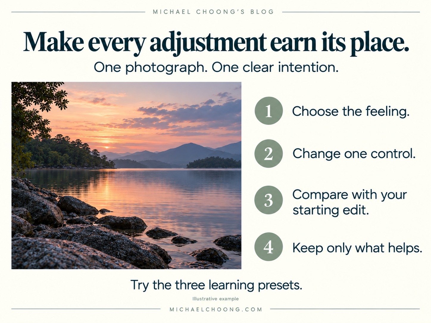
Your exercise for this week
Choose a photograph and write down the feeling you want before editing it.
Make three copies from the same balanced starting point. Apply one learning preset to each, then compare them at the same size. Keep the crop, exposure and white balance consistent during this comparison.
Choose the version that best supports your intention. Make one further adjustment and explain why you made it. Perhaps you reduced blue shadows to keep the trees natural, or removed the midtone warmth to preserve the evening coolness.
Share your chosen version and that one decision in the comments. I’d love to hear what you kept, what you changed and what you noticed.
For more practical field lessons and editing exercises, subscribe to Michael’s Lens.
