
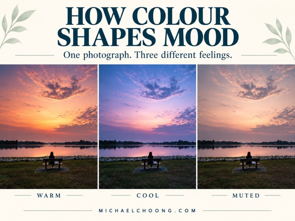
You can make a photograph warmer without making it better.
A little more yellow in the sky. A touch more orange in the reflections. Everything looks richer, yet the quiet evening you remember has somehow disappeared.
It’s easy to do. We start by improving the colours and end up changing the feeling without quite meaning to.
Last week, I shared my simple camera setup for landscape photography. This week, let’s look at what happens after we bring those photographs home.
Colour grading gives us a way to shape the atmosphere of a photograph. The useful starting point is deciding what we want that atmosphere to be.
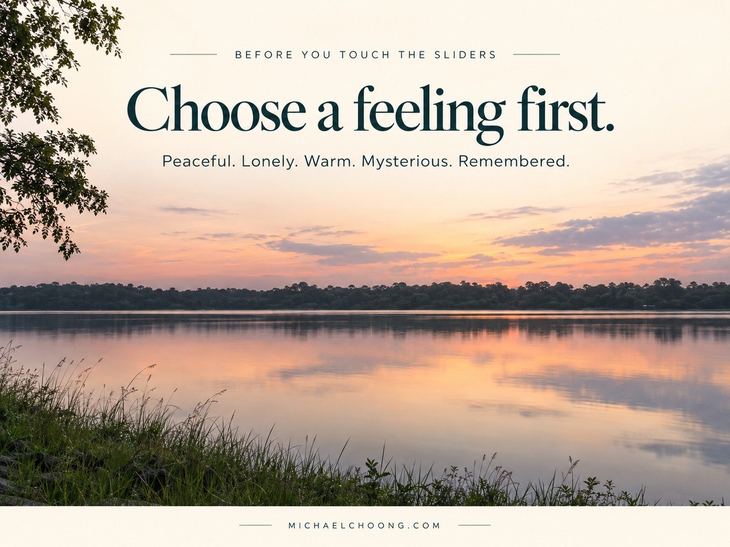
Before the sliders, choose a feeling
Imagine standing beside a reservoir just after sunset. The water has settled. The trees are becoming silhouettes. A little warmth remains near the horizon, but the rest of the scene is slipping into blue.
You could emphasise that last warm glow. You could also hold on to the coolness and sense of quiet.
Both are creative choices. What matters is whether you make that choice deliberately.
Before editing, try describing the photograph in one or two words. Peaceful. Lonely. Fresh. Restless. Warm. Remembered.
Decide how the photograph should feel before moving the sliders.
That small decision gives you something to judge each adjustment against. More colourful might be appealing, but does it support the feeling you chose.
Colour correction and colour grading
Colour correction gives you a sound starting point. You might remove an unwanted green cast, adjust white balance or bring overly strong colours under control.
Colour grading is the creative shaping of those colours to support a mood or visual style.
The two overlap. White balance can correct an unwanted cast, but it can also make a scene feel warmer or cooler. You don’t need to worry about the label every time you adjust it.
For this exercise, first make a balanced edit that preserves the character of the light. Then explore a creative treatment.
A sunset doesn’t need to become perfectly neutral. Neither does the blue light after sunset need to look like midday.
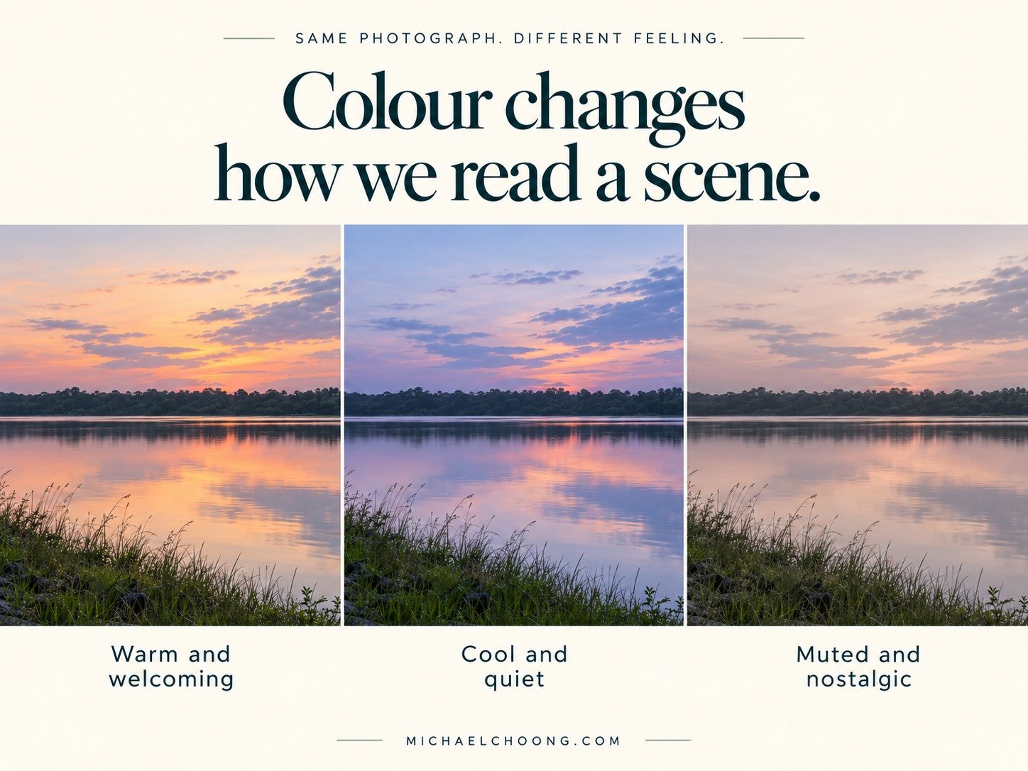
One landscape, three different moods
Picture a simple photograph of a tree beside still water, with a pale evening sky behind it.
Keep the crop and composition identical across all three versions. Let the colour treatment do most of the talking. These are possible interpretations to try, rather than promises about how every viewer will feel.
Warm and welcoming
Gently warm the lighter parts of the photograph. Let the glow sit in the sky and its reflection, while keeping some cooler colour in the shade.
That separation can suggest lingering sunlight without covering the entire photograph in orange.
Watch the tree and surrounding greenery. If everything starts looking yellow, reduce the warmth and compare again.
This treatment might suit an image where you want to emphasise comfort, warmth or the pleasure of being outdoors at the end of the day.
Cool and quiet
Try a slightly cooler balance and a restrained blue tint in the shadows. Keep any remaining warmth near the horizon if it helps the scene.
Avoid making the water, sky and land equally blue. Small differences between them help the photograph retain depth and interest.
A cool treatment might suggest stillness, distance or the last light fading. It can also feel fresh and inviting. Blue doesn’t automatically mean sadness.
Muted and nostalgic
Reduce the intensity of distracting colours, keeping a little warmth in the light. You could soften the contrast slightly, while retaining enough dark tone to hold the scene together.
The aim is a quieter palette, with fewer colours competing for attention.
This might suggest a memory or an unhurried moment. But muted colour alone doesn’t create nostalgia. The subject, light and your viewer’s own experiences still matter.
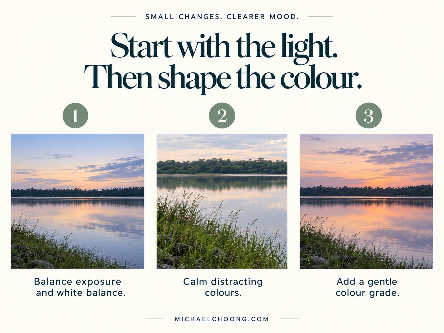
A simple Lightroom workflow
You don’t need to use every colour tool on every photograph. Make one change, look at the whole frame, then decide whether another is needed.
1. Build a balanced starting edit
Begin with your crop, exposure and tonal adjustments. Decide how bright the photograph should feel, then check the highlights and shadows.
Colour is easier to judge once brightness and contrast are reasonably settled. A scene that is too dark may feel heavy before you add any colour treatment at all.
Keep a version of this starting edit so you can compare it with the graded result.
2. Set white balance with the light in mind
Move Temperature gently warmer and cooler. Notice what happens to the sky, water and any familiar surfaces in the scene.
Use Tint if there is an unwanted green or magenta cast. Avoid adjusting it simply because the slider is there.
Look beyond the most colourful part of the picture. A pleasing sunset sky can distract you from rocks that have turned purple or a white building that now looks orange.
3. Tidy individual colours
Look for a colour that pulls your eye away from the subject. Perhaps the grass feels too bright, or the blue in the water overwhelms a delicate reflection.
Use the individual colour controls in Lightroom’s Colour Mixer to make a small adjustment. Lower the distracting colour’s saturation before deciding whether its hue also needs changing.
Be aware that the same colour may appear elsewhere in the photograph. An adjustment intended for the sky may affect the water too.
You’re deciding which colours deserve attention. They don’t all need equal strength.
4. Add a gentle grade
Lightroom’s Colour Grading panel lets you tint shadows, midtones and highlights separately. Hue chooses the colour, Saturation controls its strength and Luminance adjusts brightness. Blending changes how the tonal treatments overlap, while Balance shifts emphasis between shadow and highlight treatments. Adobe explains these controls in its colour grading tutorial.
Start with just one tonal range. For the warm version, try a subtle warm highlight tint. For the cool version, try a gentle blue shadow tint.
As a practice starting point, try a Saturation value around 5 to 10 on the chosen wheel. This is an exercise suggestion, not a universal setting. Its effect depends on the photograph and your other edits.
Leave the remaining controls alone initially. Compare the result, then adjust Blending or Balance only if the distribution of colour needs changing.
You don’t have to put colour into all three wheels.
5. Compare, then step away
Switch between the balanced edit and the graded version. Look at the subject first, then the edges of the frame and any areas that should remain fairly neutral.
Check whether the mood is clearer, whether the colours belong together and whether anything has become distracting.
Then take a short break. After looking at a strong colour cast for several minutes, it can start to feel normal. A fresh look often makes the next adjustment obvious.
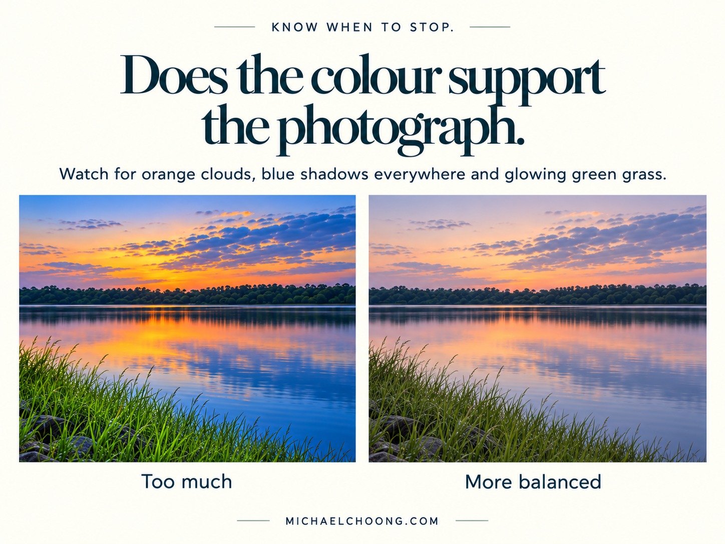
Common colour grading mistakes
Warming the whole photograph
If you want to emphasise warm light, start where that light actually appears. Keeping some cooler areas can help the warmth feel more convincing.
Adding orange and blue to everything
Warm highlights and cool shadows can work beautifully. They can also become a habit that gives every location the same atmosphere.
Look at the colours already present before introducing a new pair.
Making every colour stronger
More saturation can make a thumbnail stand out, but it can also overwhelm the subject. Try reducing one distracting colour before increasing the colours you like.
Copying a look without considering the light
A treatment that suits a misty forest may feel uncomfortable on a bright beach. Use a preset as an opening suggestion and adjust it for the actual photograph.
Losing the character of the place
Watch foliage, skin, clouds and familiar surfaces. A creative treatment can be strong and intentional, but accidental colour casts often weaken the image.
For a natural landscape edit, I’d keep asking whether the light still feels believable.
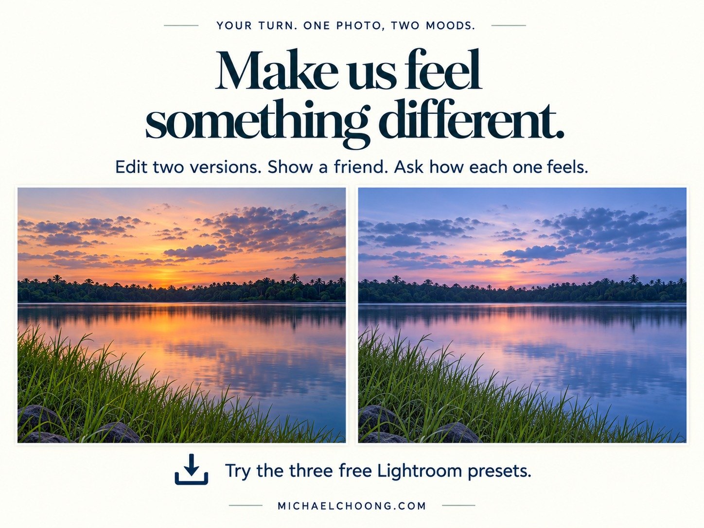
Try the three colour moods yourself
I’ve put together three free Lightroom presets to help you explore these moods on your own photographs. Warm and Welcoming, Cool and Quiet, and Muted and Nostalgic.
Use them as starting points. Choose a photograph, apply a preset, then adjust the strength, exposure and white balance to suit the scene and the feeling you want to create.
[DOWNLOAD] the Michael Choong Colour Moods Presets
If you’re new to presets, follow the step by step guide to install them and get started.
[DOWNLOAD] the installation and quick start guide
The presets are inspired by the three moods discussed here. Results will vary with your photograph and won’t exactly reproduce the illustrative comparisons.
Your exercise for this week
Choose one landscape photograph with a simple composition. A reservoir scene, a coastal view or a tree in soft light would give you room to experiment.
Make a balanced starting edit, then create two versions with different moods. Keep the crop the same and, for this first attempt, keep brightness and contrast similar so you can judge the colour changes more clearly.
Give each version a private one-word description. Then show both to someone without sharing those descriptions. Ask what each photograph makes them feel and which part of the picture gives them that impression.
Their answer might surprise you. That’s useful. It tells you how your choices are being read.
You can try this with a photograph from our recent Upper Seletar Reservoir outing, or any landscape already in your collection. Start with the version that feels closest to the moment you remember, then explore another interpretation.
The next time you open Lightroom, give yourself a feeling to work towards. Make each colour adjustment earn its place.
Share your two versions and the moods you were aiming for in the comments. For more photography ideas, field lessons and practical editing exercises, subscribe to Michael’s Lens.
