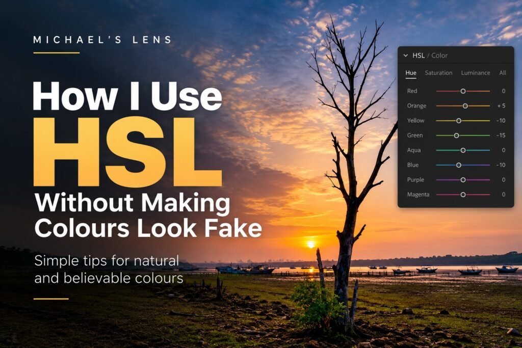
Colour is one of the easiest things to overdo in Lightroom.
You move a few sliders. The sky becomes deeper blue. The grass looks greener. The sunset becomes warmer.
For a moment, everything looks better.
Then you come back later and wonder why the photograph looks slightly strange.
I’ve done this many times.
Last week, I wrote about knowing when to stop editing. This week, I want to look at one tool where that idea matters a lot, HSL.
HSL gives us much more control than simply increasing Saturation or Vibrance. But that control also makes it very easy to push individual colours too far.
Used carefully, it can help a photograph feel more natural.
What does HSL actually mean?
HSL stands for:
Hue
Saturation
Luminance
Lightroom lets us adjust these for individual colour ranges such as red, orange, yellow, green, aqua and blue.
That’s what makes HSL so useful.
Instead of increasing the saturation of the whole photograph because the sky looks weak, I can work mainly on the blues.
If the grass is too bright, I can adjust the greens and yellows without changing the sunset.
If warm evening light doesn’t quite feel the way I remember it, I can work with the orange and yellow tones.
But there’s one important thing to remember.
HSL works with colours, not objects.
The Blue slider doesn’t know what a sky is.
If your photograph contains blue water, blue clothing or blue reflections, those areas may change too.
That’s why I always watch the whole photograph while moving the sliders.
Start with the problem, not the sliders
I try not to open HSL and start moving colours just because the controls are there.
Instead, I ask myself:
What colour is bothering me?
Perhaps the green foliage feels too yellow.
Maybe the blue sky is a little too bright.
Perhaps one orange area is pulling too much attention away from the subject.
Once I know the problem, I can decide whether Hue, Saturation or Luminance is the right tool.
This keeps the edit much simpler.
And usually much more natural.
Hue changes the colour itself
Hue shifts one colour towards another.
Move the green Hue slider one way and the greens move towards yellow.
Move it the other way and they move towards aqua.
The same idea applies to the other colour ranges.
This can be useful with foliage.
Sometimes a landscape has very yellow-green vegetation, especially under strong sunlight. A small Hue adjustment can move that colour towards a calmer green.
But this is also where things can quickly become unnatural.
Push greens too far and the photograph may suddenly look like it was taken somewhere completely different.
My approach is simple.
Move the slider enough to see what it does.
Then pull it back.
The first movement helps me understand the colour range. The second movement is usually closer to where I actually want the photograph to end up.
Saturation controls how strong the colour feels
This is probably the HSL control most people understand immediately.
Move Saturation up and the colour becomes stronger.
Move it down and the colour becomes quieter.
But I think the most useful Saturation adjustment is often reducing, not increasing.
Imagine a landscape at sunset.
The warm sky already has beautiful orange tones, but there’s a patch of very bright green grass in the foreground.
Increasing the orange may make the sunset stronger.
But reducing the distracting green slightly may actually improve the photograph more.
The sunset hasn’t changed.
We’ve simply stopped another colour competing with it.
That’s an important part of editing for me.
Not every adjustment needs to make something stronger.
Sometimes the best adjustment makes something else quieter.
Luminance changes how bright a colour appears
Luminance is probably my favourite part of HSL.
It lets us make a colour range brighter or darker without simply changing its saturation.
Take a blue sky.
If I reduce Blue Luminance, the sky becomes darker and can gain more visual depth.
But push it too far and the blue may start looking heavy or unnatural.
The edges around clouds can also begin to look strange.
The same idea works with warm colours.
Increasing Orange or Yellow Luminance slightly can sometimes help warm light feel brighter without needing much more saturation.
That distinction matters.
Sometimes we think a colour needs to be more saturated when what it really needs is to be a little brighter.
A simple way I think about the three controls
When I’m deciding what to change, I think about HSL like this:
Hue: Is this the right colour?
Saturation: Is this colour too strong or too weak?
Luminance: Is this colour too bright or too dark?
That’s usually enough.
You don’t need to change all three.
If the colour already looks correct, leave Hue alone.
If the strength feels right, don’t touch Saturation.
Editing becomes much easier when we stop feeling that every slider needs an adjustment.
Watch the neighbouring colours
This is one of the most important things to understand about HSL.
Real photographs rarely contain perfectly separated colours.
Grass may contain both green and yellow.
A sunset may contain red, orange and yellow.
A blue sky may move from aqua near the horizon to deeper blue higher up.
So changing only one slider may not affect everything you expect.
For example, if you’re trying to change foliage and the Green slider isn’t doing very much, try looking at Yellow.
You may discover that much of what looks green to your eye actually falls inside Lightroom’s yellow colour range.
This happens quite often.
The same is true with skin, sunsets, water and many other subjects.
Use the Targeted Adjustment Tool
There’s a useful little tool inside Lightroom’s HSL or Color Mixer panel that can save a lot of guessing.
Instead of deciding whether something is orange, yellow or green, click the Targeted Adjustment Tool and place it over the colour in the photograph.
Then drag up or down.
Lightroom adjusts the relevant colour ranges for you.
I find this particularly useful when a colour sits between two ranges.
It also teaches you something about your photograph.
You start seeing that the colour you thought was green might contain a lot of yellow.
Or that a sunset you thought was mainly orange also contains quite a bit of red.
Be careful with skies
Blue skies are a classic example of HSL going too far.
It’s tempting to reduce Blue Luminance and increase Blue Saturation until you get a rich, dramatic sky.
It can look impressive.
But look carefully at the edges of clouds, trees, mountains and buildings.
That’s often where an aggressive HSL adjustment gives itself away.
The blue may become too dark compared with the rest of the light in the scene.
A photograph taken in soft afternoon light suddenly has a sky that looks like it belongs to a completely different exposure.
When that happens, I pull it back.
The sky should still belong to the photograph.
Be careful with green too
Green is another easy colour to over-edit.
Landscape photographers naturally work with a lot of vegetation.
The temptation is to make everything lush and rich.
But nature contains a huge range of greens.
Some are yellow.
Some are muted.
Some are almost brown.
Making all foliage a beautiful saturated green can actually remove some of that variation.
And once that variation disappears, the landscape often starts looking less believable.
Sometimes slightly imperfect colour feels much more natural.
Compare before and after
When I finish working with HSL, I like to switch the panel off and on.
Not because the edited version should look like the original RAW file.
It shouldn’t necessarily.
I’m asking something simpler.
Did the colour adjustment help me notice the photograph, or did it make me notice the colour?
If the first thing I think is, “Wow, that blue is strong”, I’ve probably gone too far.
If I simply feel that the photograph looks more balanced, I’m usually closer.
[Insert before and after example here]This would also be a good place to compare three versions of the same photograph:
Original RAW
HSL pushed too far
Final balanced edit
Seeing the three together often explains more than a dozen Lightroom sliders can.
My simple rule, pull it back a little
There’s a small habit I use with many editing tools.
Once I think the adjustment looks right, I pull it back slightly.
Not every time.
But often enough.
Our eyes adapt very quickly while we edit.
What looked strong five minutes ago starts feeling normal, so we add a little more.
Then a little more.
That’s how colour slowly gets away from us.
Pulling the adjustment back gives the photograph a little room to breathe.
HSL should support the photograph
HSL is a powerful tool because it lets us work with colour selectively.
But selective doesn’t necessarily mean dramatic.
I might use it to calm down a distracting green.
Darken a blue sky slightly.
Brighten warm evening light.
Or gently shift foliage away from yellow.
Most of the time, I’m not trying to create a completely new colour palette.
I’m trying to help the colours that were already there work better together.
That comes back to the same idea from last week.
The viewer shouldn’t be thinking about my Lightroom sliders.
They should be looking at the photograph.
And if the colour feels natural enough that nobody stops to question it, that’s usually a good place for me to stop.
Next week, HSL or Colour Grading?
HSL and Colour Grading both change colour, but they work in very different ways.
HSL starts with the colour itself.
Colour Grading starts with the brightness of an area, the shadows, midtones and highlights.
That difference affects when I use each tool.
Next week, I’ll show you how I decide between HSL and Colour Grading, and why I often use a little of both rather than pushing either one too far.
Michael
