
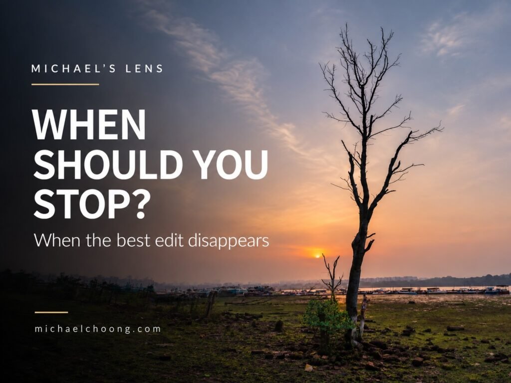
Sometimes the hardest part of editing a photograph isn’t knowing what to do.
It’s knowing when to stop.
You open a photo in Lightroom. The sky looks a little flat, so you add contrast. The colours could be stronger, so you increase saturation. The foreground feels dark, so you lift the shadows.
Then you add a mask.
Then another.
Twenty minutes later, the photograph looks impressive.
But does it still look good?
That’s a question I ask myself quite often.
Remember why you took the photograph
Before I start editing, I try to remember what made me stop and take the picture in the first place.
Was it the light?
The colour?
The mist?
The quiet feeling of the scene?
Or perhaps it was simply the way one small patch of light fell onto the landscape.
That matters because editing should support that original reason.
If soft morning light attracted me to a scene, there’s little point turning it into something dark and dramatic just because Lightroom allows me to.
The edit may look impressive.
It just might not be the photograph I wanted to make.
Correct first, create later
My first adjustments are usually quite boring.
And that’s a good thing.
I normally begin with the basics.
Exposure.
White balance.
Highlights and shadows.
Black and white points.
Lens corrections.
Maybe a little contrast.
At this stage, I’m not trying to create a mood.
I’m simply trying to get the photograph into a good starting position.
Once the image feels balanced, I can decide whether it actually needs anything more.
Very often, it needs less than I first thought.
Guide the viewer’s eye
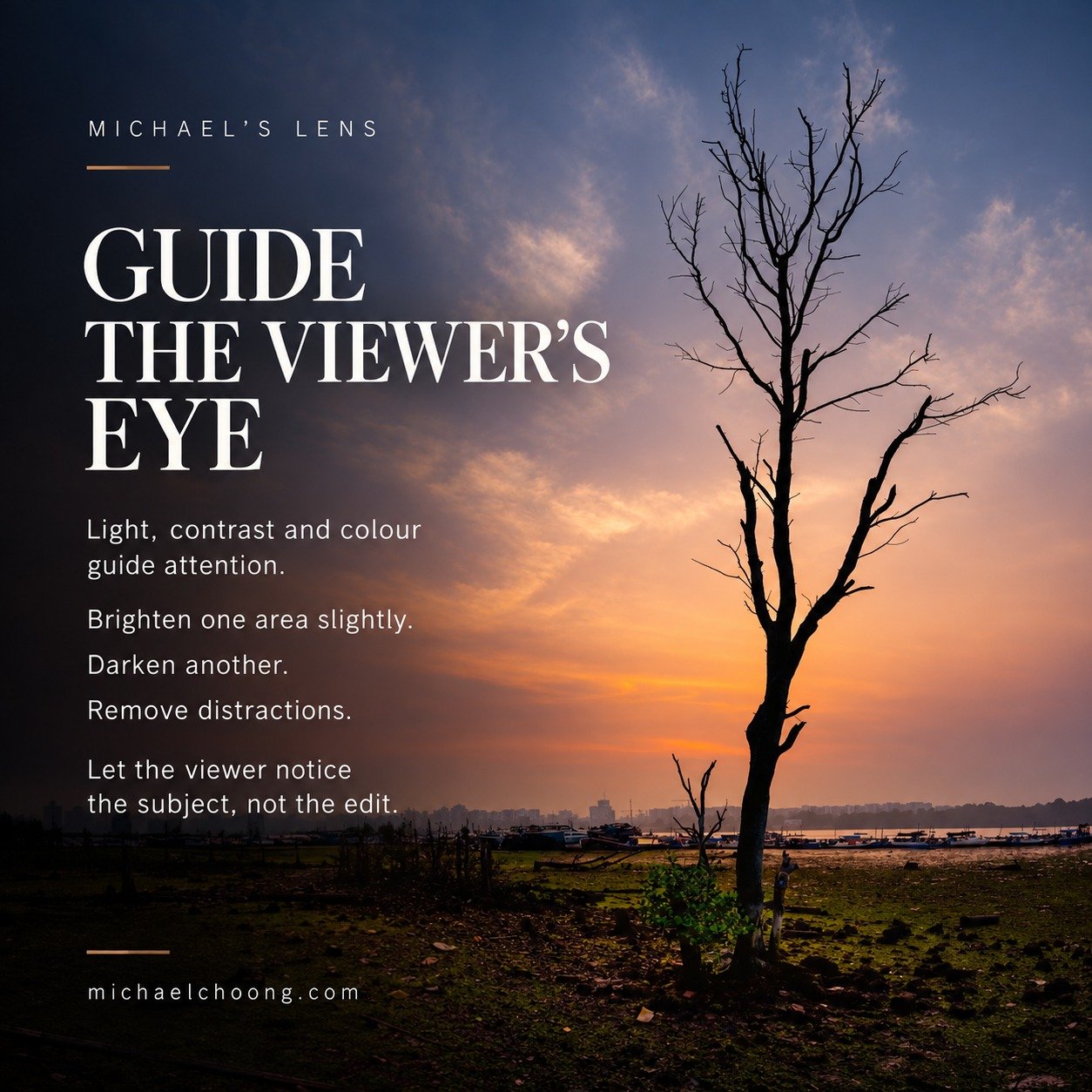
One of the most useful things editing can do is guide someone through a photograph.
Our eyes naturally move towards light, contrast and colour.
So I might brighten one area slightly.
Darken another.
Reduce a distracting colour.
Or add a little warmth to the light.
The important word here is slightly.
If someone looks at my photograph and immediately thinks, “That area has been masked”, I’ve probably pushed the adjustment too far.
I want them to notice the subject.
Not my Lightroom skills.
Colour is probably one of the easiest things to overdo.
A little warmth can make late afternoon light feel beautiful.
A touch of blue in the shadows can make a photograph feel quieter.
Colour grading can help create atmosphere.
But every colour adjustment affects how we read the photograph.
Push things too far and green grass becomes fluorescent.
Sunsets become orange.
Blue skies start looking almost electric.
At some point the colour stops supporting the photograph and starts becoming the subject.
When that happens, I normally pull things back.
The before and after test
I regularly press the backslash key in Lightroom to compare my edit with the original.
This is one of the simplest checks you can make.
Not because the edited version must look similar to the RAW file.
RAW files often need work.
What I’m checking is something else.
Did I actually improve the photograph?
Sometimes the difference is obvious.
Other times I realise I’ve spent ten minutes making the image different rather than better.
There’s a big difference between the two.
Walk away from the screen
This is probably my favourite editing technique.
Do nothing.
Leave the computer.
Make coffee.
Do something else.
Come back later.
Our eyes adapt very quickly while editing.
Increase saturation a little and it soon looks normal.
Increase it again and that becomes normal too.
The same happens with contrast, sharpening, clarity and colour grading.
When you return with fresh eyes, heavy editing often becomes surprisingly obvious.
Sometimes I open a photograph the next morning and immediately think,
“What was I doing?”
Then I pull everything back.
Try removing your strongest adjustment
Here’s another simple test.
Look through your Lightroom adjustments and find the strongest one.
Maybe it’s a sky mask.
Perhaps it’s a big saturation increase.
Maybe you’ve added a lot of clarity or changed the colour grading.
Turn it off.
Look at the photograph again.
Then turn it back on.
Ask yourself one question.
Does this adjustment help the photograph, or am I keeping it simply because I spent time creating it?
Sometimes removing one adjustment improves the whole picture.
The best edit often disappears
I sometimes compare editing with cooking.
A good cook doesn’t cover good ingredients with seasoning.
The seasoning helps bring out what is already there.
Photography feels similar to me.
A good edit shouldn’t shout for attention.
It should help the light, colour, composition and subject work together.
The viewer doesn’t need to know what masks I used.
They don’t need to know how many Lightroom sliders I moved.
They only need to feel something when they look at the photograph.
That’s usually my signal to stop editing.
When there’s nothing left I genuinely need to fix, I leave it alone.
Because the goal isn’t to prove how good we are at Lightroom.
It’s to help someone see what we saw and, hopefully, feel a little of what we felt when we pressed the shutter.
Next week: What does HSL actually do?
Next week, we’ll get a little more technical again.
We’re going to look at one of Lightroom’s most useful colour tools, HSL.
HSL stands for Hue, Saturation and Luminance.
Rather than changing every colour in your photograph at once, HSL lets you work with individual colour ranges.
You can change what a colour looks like with Hue.
Control how strong that colour feels with Saturation.
And make the colour brighter or darker with Luminance.
For example, instead of increasing the saturation of an entire landscape, we can work specifically with the greens in the trees, the blues in the sky or the orange tones around sunset.
Used carefully, HSL can make colour feel much more natural.
Used badly, it can also make a photograph look strange very quickly.
Next week I’ll show you how I use HSL, what each slider actually does, and a few simple mistakes I try to avoid.
See you next week.
Michael
